Taylor Davidson · Card Architecture and Card Design
If you’ve used Twitter, Google, Tinder, Secret, Spotify, Pinterest, Jelly, Kik, Facebook’s Paper app or a host of newer startups, you’ve probably seen a card. Cards have quickly become a dominant design pattern for mobile devices because of how the design format is able to deliver information in an easily readable, scannable format that is easily navigable with a single finger, often the thumb.
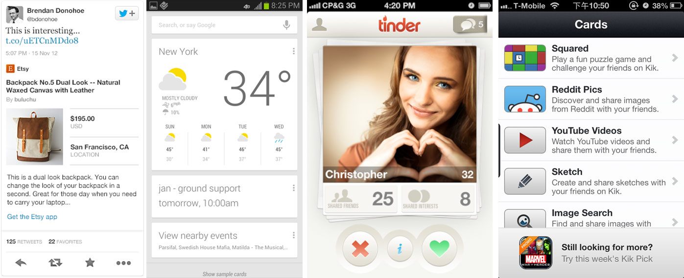
The easiest form of cards to understand today are the cards by Tinder, Jelly, Spotify and others, where the card is a design metaphor for how to deliver information that is easy to read and act on, particularly for mobile. The rise of mobile created user interface and user experience pressures on many mobile websites and mobile apps, and the information and interaction design of cards emerged as a solution and an opportunity. When we rewire how we access the web, we rewire how we use it.
The two most obvious forms of cards on the web today might be Twitter and Google. Twitter’s cards allow websites and apps to display extended information about the content behind a link being shared in a tweet: for example, instead of just seeing a link to an article, a viewer could see a photo, the title, headline, author, and a description about the post after the click. Or download an app, or watch a video in-line, or view a summary of a product, or sign up for a newsletter, powered by app cards, video cards, product cards, or lead-generation cards, different structured card formats that Twitter created for different uses.
Google uses a similar structure to power Google Now, a set of cards that display contextually-important information about the weather, how to get to your next meeting, and more, using a mixture of information from accessible services, including your calendar, email, location, and more.
But there’s a significant difference between Tinder / Spotify / Pinterest cards and Twitter / Google / Kik cards, as the first is a design and interaction model, and the latter layers on a web services architecture model. *
Why do we care about cards? Are they a big deal?
As a design model, a card is an important evolution because it addresses the specific demands of mobile devices and interfaces very effectively. Cards combine an information design pattern with a set of gesture interaction methods (swipes, flicks) that create efficient user experiences (and perhaps, great engagement metrics). Consider cards as part of the evolution from web pages to web streams to mobile streams, refining the feed-based content model used by web and mobile sites into the potential “atomic unit of content” on mobile.
But beyond the design cue, the larger significance of cards are the architecture behind them. In the implementations of cards by Twitter, Google, Kik and others, the card does more than just deliver first-party content from an internal API, but utilizes the structured interface of a card to display data from a variety of third-parties using first-party data. For example, a Tinder card is a structured display of first-party content from Tinder, while a Twitter card is a structured display of third-party content that is served natively into the card that may also be personalized using first-party Twitter data.
These two types of cards may be thought of as “1st party card interfaces” and “3rd party card interfaces", but however they are defined, it’s an important distinction. A Tinder card is a unit of content. A Twitter card is a platform.
It’s important to note that while cards are not the first method for distributing content, but they are the first for distributing context.
In 1993 the <img> tag was initially proposed and implemented by Marc Andreessen in Mosaic to embed an image into a web page. Years later, <embed>, <applet>, and <object> were created to embed other forms of interactive media into web pages, from Adobe and many others.
In the early 2000s widgets emerged as small applications that could be installed and executed within the web page of an end user. Widgets were commonly used to “do something useful with information fetch from other websites”, most notably games, polls, and other interactive units of content that used information from third-party websites. Slide, started in 2004 as a side project, and RockYou, who rose to prominence by 2007 for their Facebook apps, were notable examples in the space.
Of course, while widgets died away, embeddable rich media has grown to be an incredibly popular method for distributing content (and advertising), most notably videos (YouTube, Vimeo, et. al.), documents (Slideshare and others), sound (Soundcloud and others), and rich media ads. It has proven to be a successful protocol for websites to display third-party content and keep people within the experience of their sites, and a powerful way to create more engaging ads.
But there’s a couple limitations to the protocol, in that most formats of embeddable media require some design modifications for the mobile web and apps, but more importantly that embeddable media is simply a method to distribute and display third-party content. Cards are the successor to embeddable media because they can aggregate content from multiple sources, third-party and first-party, and allow developers to create rich interactions in a consistent design format that works across multiple formats (web, mobile, apps, wearables, and more.
Thus, the difference between the card design and the card architecture is important, because the architecture creates the potential for far wider value creation. The risk, however, is that it creates more conflicts between the dominant platforms today. The prominent card platforms today, Google, Twitter, Apple, and potentially Facebook, will all limit the interactivity of cards through their terms of service to support their own interests and business models. Do you enable reach across platforms, or hold on to exclusivity and control the customer experience?
It’s interesting to think about cards as ads, or as “native ads”, perhaps the eventual evolution from ads to content. For that to happen at scale, it’s likely that we’ll see open card platforms, like Wildcard and Citia, create interoperability and reach across websites and platforms, similar to how the adtech ecosystem evolved around ad networks, exchanges, and SSPs and DSPs. It’s not far-fetched to imagine programatically buying card placements the same way we buy ads today. Twitter is close to being able to do this, given that a tweet using a Twitter card is a native content unit that can be bought algorithmically. Google has enabled the card interface across Google search, Google Now, and could extend it far further, but hasn’t made the move yet.
But there’s a lot to be done to get from here to there. While the card design format has become more popular, it’s still far from ubiquitous, and we’ve yet to fully integrate feeds and cards. And the plumbing behind cards as platforms is still being built. And what happens if the card design metaphor is fleeting, or replaced by the next design movement?
That’s why it’s important to separate out the card design from the card architecture, to separate information delivery from interactivity delivery, to separate content from context. There’s two important movements hitting the web today, and even if the card design movement is fleeting, the card architecture movement is real.
- At least until Tinder, Spotify, Pinterest and others begin distributing their content as cards. And then all bets are off.
- Thank you to @ryandawidjan for inspiring part of this post.